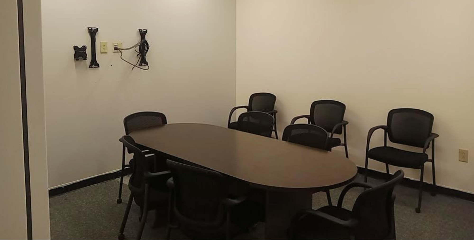
Are you looking to refresh your office with a fresh coat of paint? Commercial painting rejuvenates a building, enhances productivity, boosts office morale, and improves the company’s public image. If you’re preparing for a commercial painting project, consider your color preferences before you begin.
The professionals at GLS Painters explain how the color of your commercial space can positively or negatively affect your employees and which ones benefit productivity and morale. Continue reading to see which color to pick for your new paint job.
How Do Colors Affect Productivity and Comfort in a Commercial Space?
Colors have a significant impact on our emotions and influence our attitudes. Beige, for example, can bring feelings of depression or sadness to the office, and more vibrant colors will encourage feelings of happiness. Each color uniquely affects our well-being, and choosing a hue that enhances the preferred emotions will boost your team’s productivity.
Very aggressive shades increase energy but can negatively affect the general environment. Red or orange may reinvigorate morale but can introduce aggression and shorter tempers. Pale colors can cause depression in the wrong shade or increase comfort when chosen carefully.
Continue reading to see how each color affects office productivity and to find the ideal shade for your commercial building.
Blue
Blue is a common office color due to its calming energy. It brings peace and comfort and can increase productivity with its mentally stimulating abilities. Blue favorably affects men and women, making it a common choice.
The color of the sky and the ocean brings the following emotions:
- Clarity
- Calmness
- Peace
- Creativity
These emotions enhance the office and profits, making blue a preferred office color.
Green
Nature-inspired decor makes humans feel at ease, and green increases those feelings. Green is the color of peace, comfort, and well-being. However, coats of paint are not the only way to include feelings of peace and comfort; consider including living plants for a calming effect.
Green accents with blue walls can give employees a relaxed but productive area to maximize their work.
Purple
Purple, the color of royalty, can bring the following feelings:
- Intelligence
- Elegance
- Luxury
- Value
- Confidence
However, purple can increase depression and sadness in men. Purple typically works well in packaging, branding, and as an accent color paired with blues or greens. Purple helps people work harder and have a better outlook on their work due to the feelings of luxury and culture.
Orange
Orange provides enthusiasm, creativity, and high energy levels to the office. It’s a combination of yellow and red, which invigorate the mind. Orange works well for industries that require high levels of physical activity and endurance.
However, men tend to react poorly to orange. For optimal results, use it as an accent color. Using orange in small doses or for short amounts of time can increase productivity and encouragement.
It works better in team-building exercises or other activities than whole-unit commercial painting.
Red
Red, the color of passion, is helpful in small amounts. Red triggers a person’s fight-or-flight instincts and offers a highly stimulating atmosphere. For physical strength, fast movements, and productivity, consider implementing red.
However, in an office setting, red walls or other red commercial painting jobs may overstimulate, creating an opposite effect and harming productivity while increasing stress and anxiety. Consider red accents, or use a lighter shade, such as pink, for a more friendly atmosphere.
Red increases awareness, making it useful for safety or other important signs and drawing attention to something specific. Use red to direct people’s attention toward a portion of the office that holds essential information.
White
Pure white negatively affects people and their performance. It appears cold, sterile, and unfriendly. White creates discomfort; consider the white of hospitals or an unfurnished apartment with harsh lighting. White can make people feel generally uncomfortable, unsafe, and like they do not belong.
If you must use white, choose an off-white color such as cream, pearl, or another more gentle color.
An off-white color gives off a clean, gentle feeling that creates peace and allows employees to focus on their work. Consider off-white for a background to other colors for a pleasant office feeling and increased productivity. The sense of cleanliness creates peace of mind and helps with focus.
Yellow
Yellow provides a sense of well-being, prosperity, and friendliness. Too much yellow can overstimulate and hurt your employee’s eyes, so use it as an accent. Paired with the right colors, a gold accent can increase feelings of elegance.
A light yellow creates a friendly atmosphere and increases collaboration and enjoyment. Yellow is the color of sunlight, summer gatherings, and general happiness. Yellow increases performance, innovation, and progression.
Grey
The many shades of grey can create various emotions in an office environment. Without another color, you risk creating a subdued, depressing atmosphere. However, grey works well as a backdrop for other colors and brings peace and tranquility.
Certain shades of grey can increase focus, direction, and a sense of purpose.
Commercial Painting in Mullica Hill
What feelings do you want your office to evoke? You can increase or decrease performance and dedication, depending on your choice. Aggressive colors create stress, while vibrant and pleasant colors bring focus and happiness.
Choose your colors carefully and ensure you bring the right emotions to your workspace. If you need commercial painting in Mullica Hill, NJ, contact GLS Painters at (856) 238-1288 and request your free estimate today.
